Why I am a little picky about wardrobe colors for brand shoots. I’ll admit it. I am a stickler about wardrobe colors for brand shoots, headshots and teams. Not because I want to control someone else’s style, but because I want you to be remembered, not your outfit.
Have you heard of the quote from Coco Chanel about wanting to be remembered not for the dress, but for the woman. Whether she said it word for word or not, this applies and fits perfectly when it comes to photography.
The camera notices colors that love to steal the spotlight. Neon, super bright reds or loud patterns. They can take over and suddenly the photo becomes about the look not the person. When I guide my clients it is not about rules. It’s about results and images that feel timeless and on brand. So yes, I am picky about prints and colors. Because great brand photos should make your audience remember you and not your shirt.
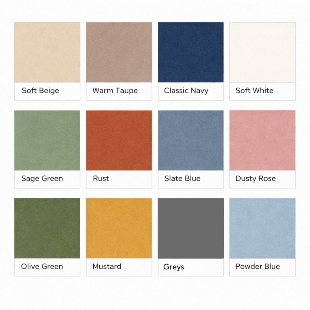
Color Tips: Soft Neutrals, Blue's and Grey’s, Soft Greens and Off White.